XANDY WEBSITE
*Website expansion of XandY Learning focused on structure, navigation, and new pages.
Date: 2025
Stack Used: Figma, User Research, User Interviews
01. Understanding the Problem
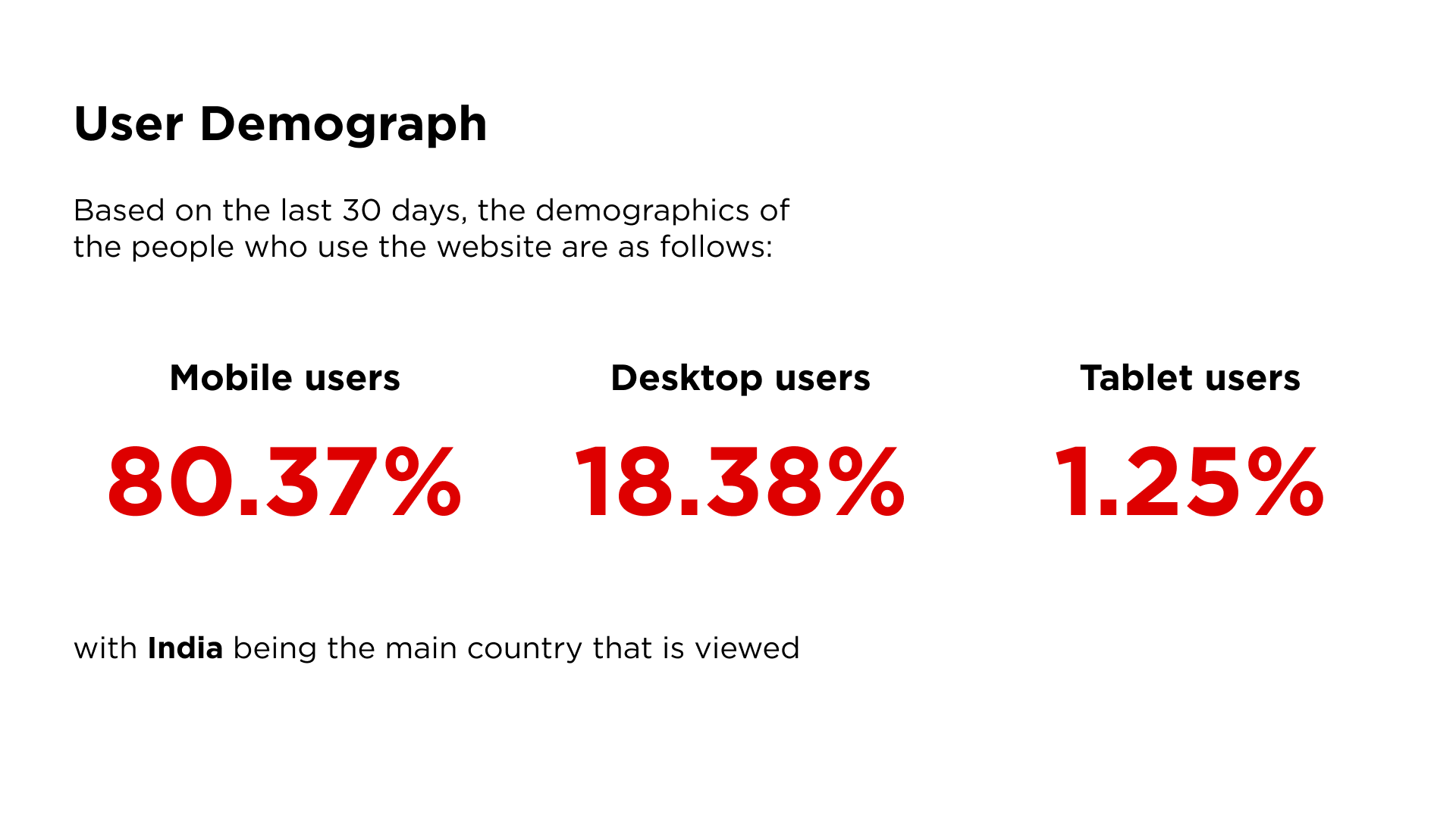
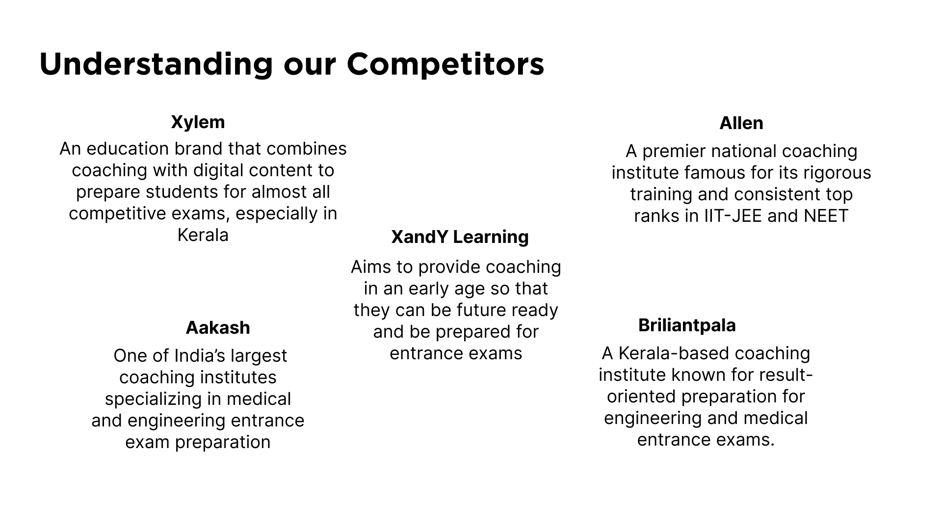
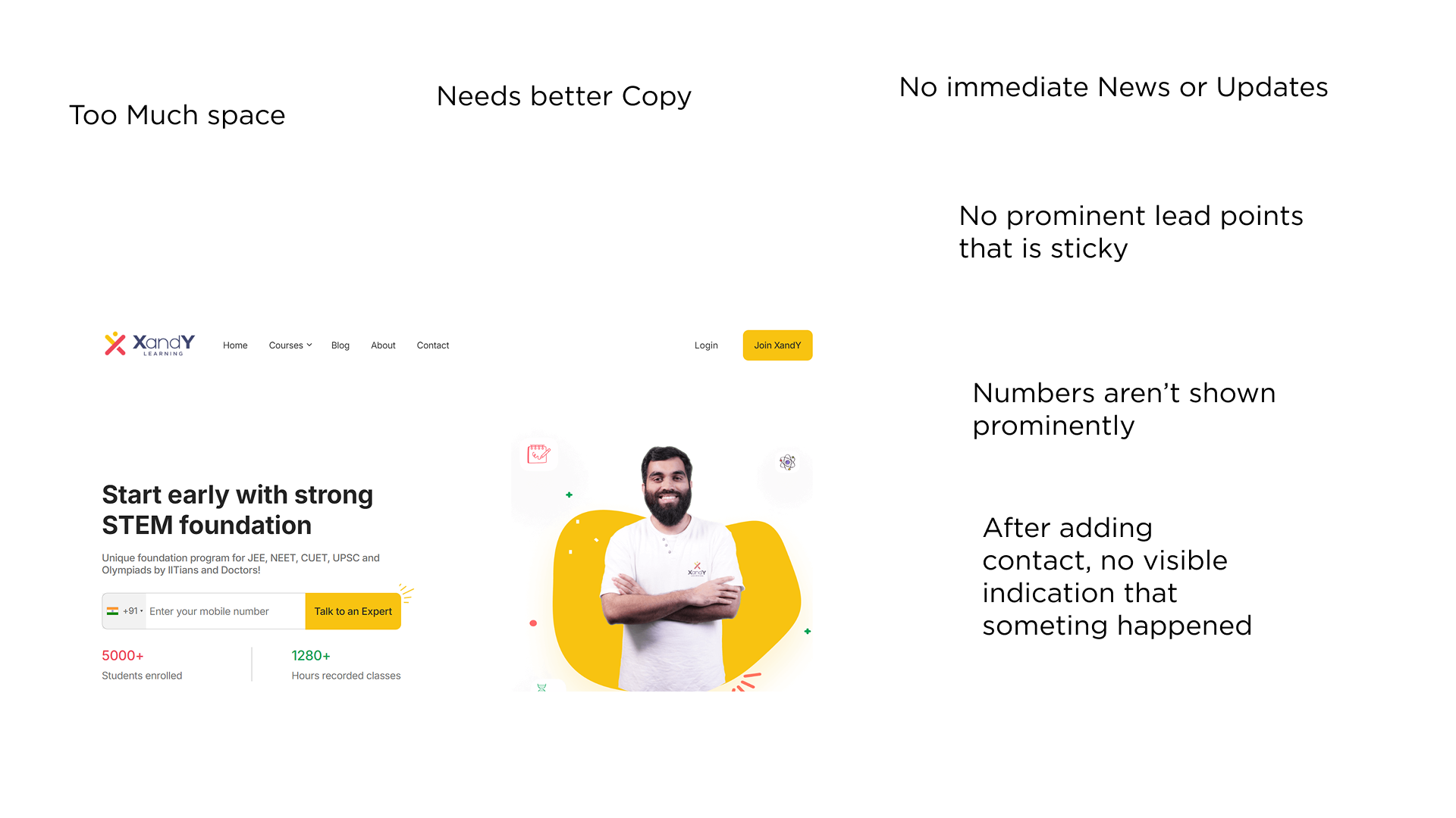
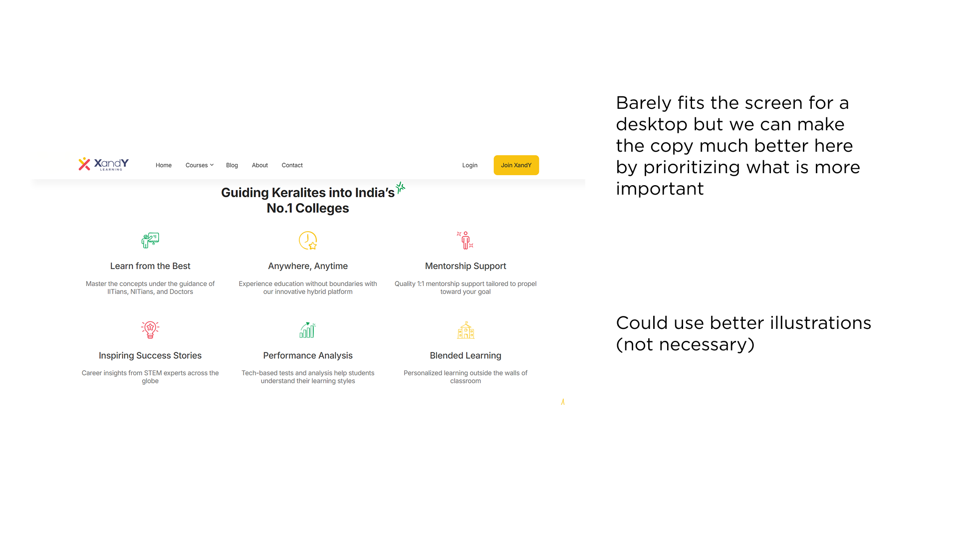
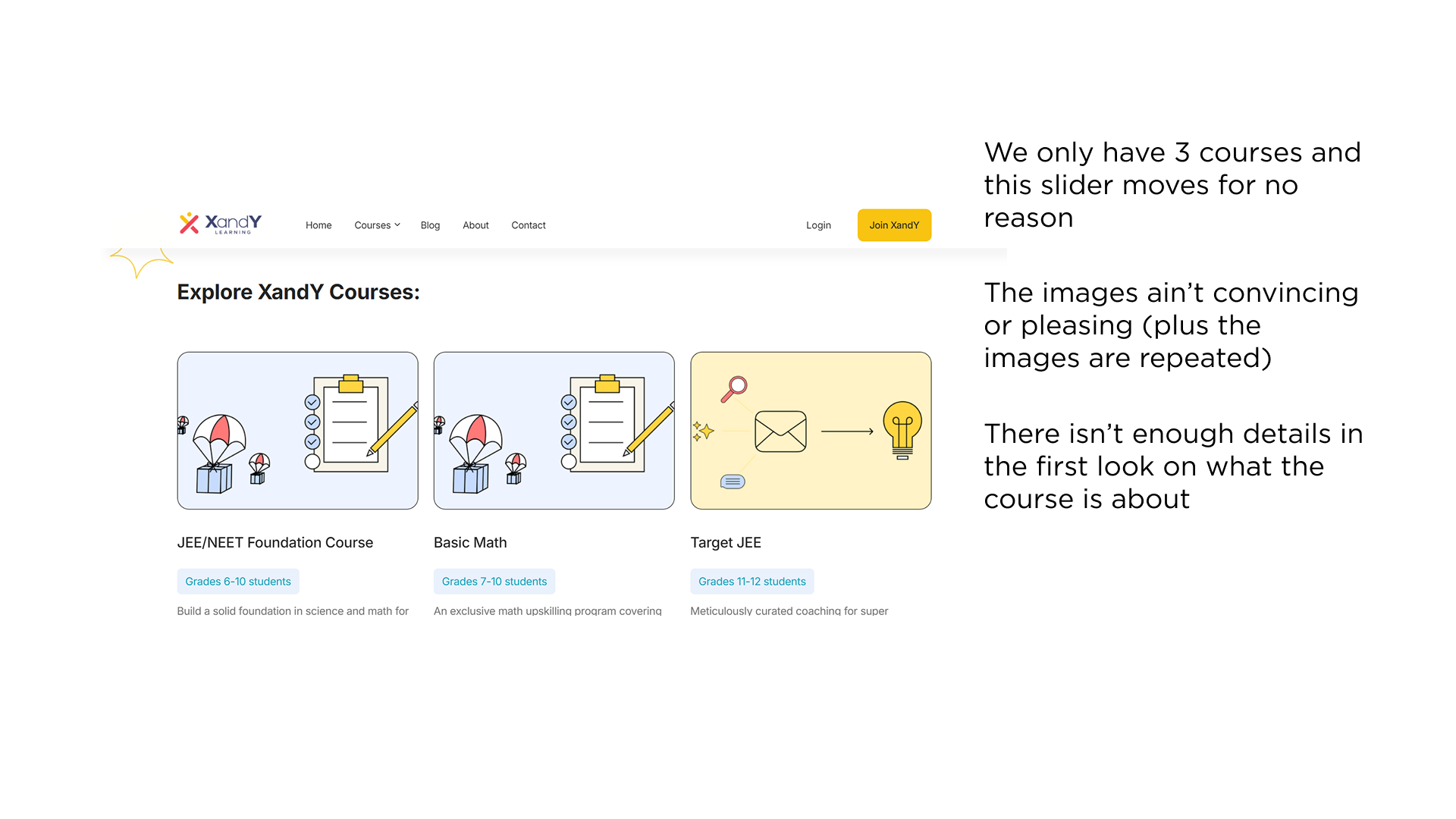
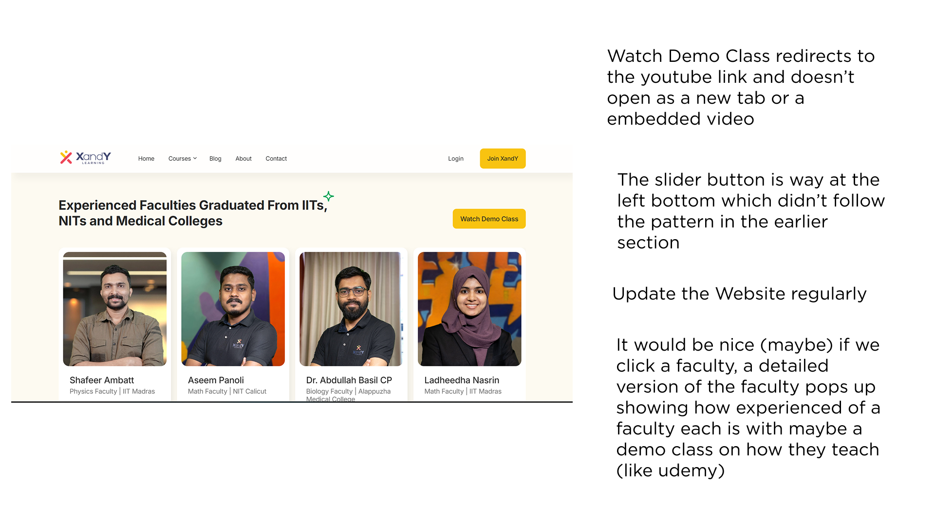
The existing XandY Learning website had an inconsistent visual experience, unclear messaging, and excessive scrolling that made it difficult for parents to understand the platform's offerings. Research using Microsoft Clarity revealed that visitors frequently sought the refund policy, indicating potential hesitation and a need to build trust more effectively.
02. Restructuring the Experience
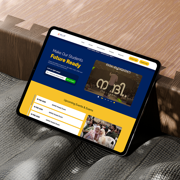
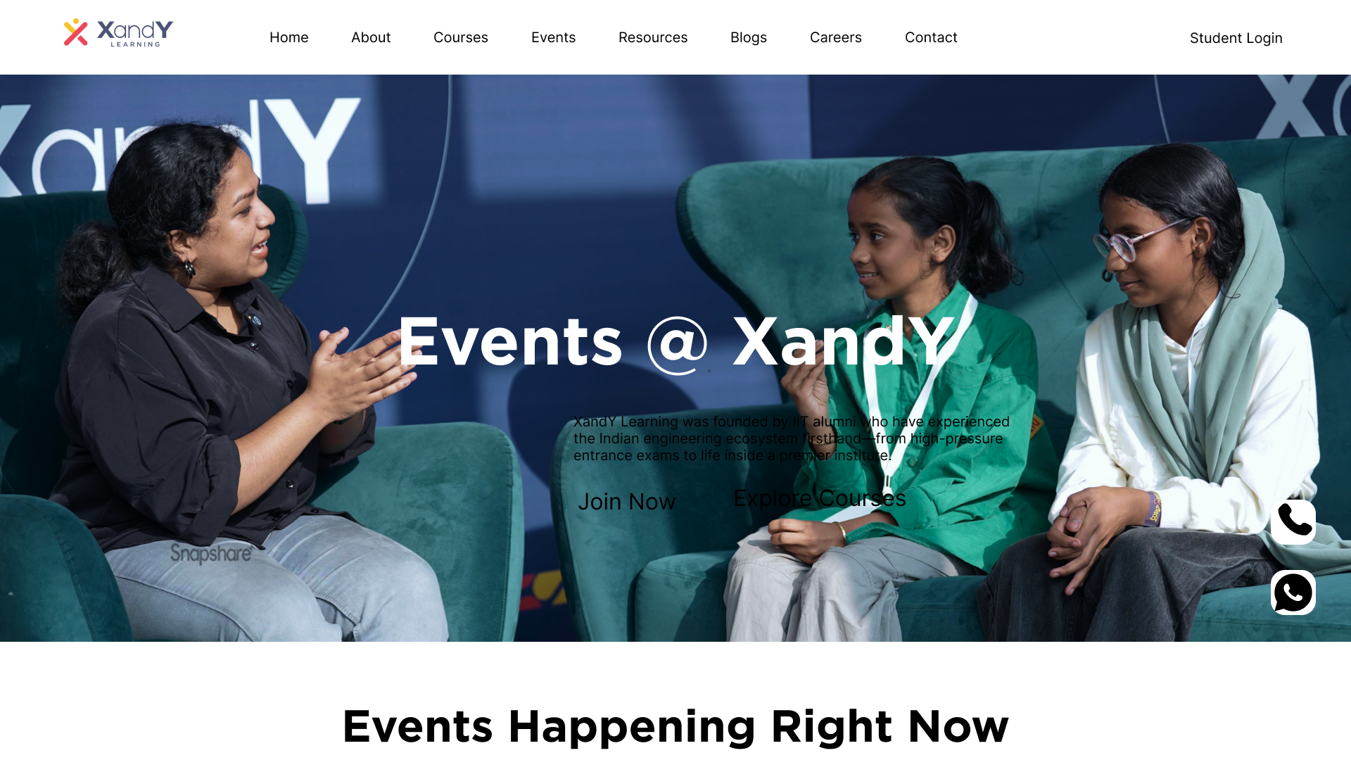
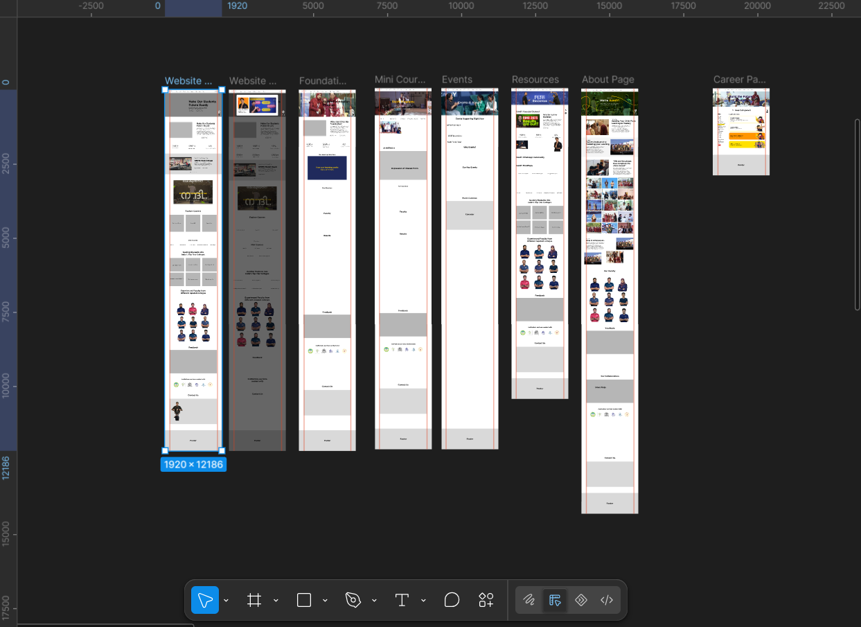
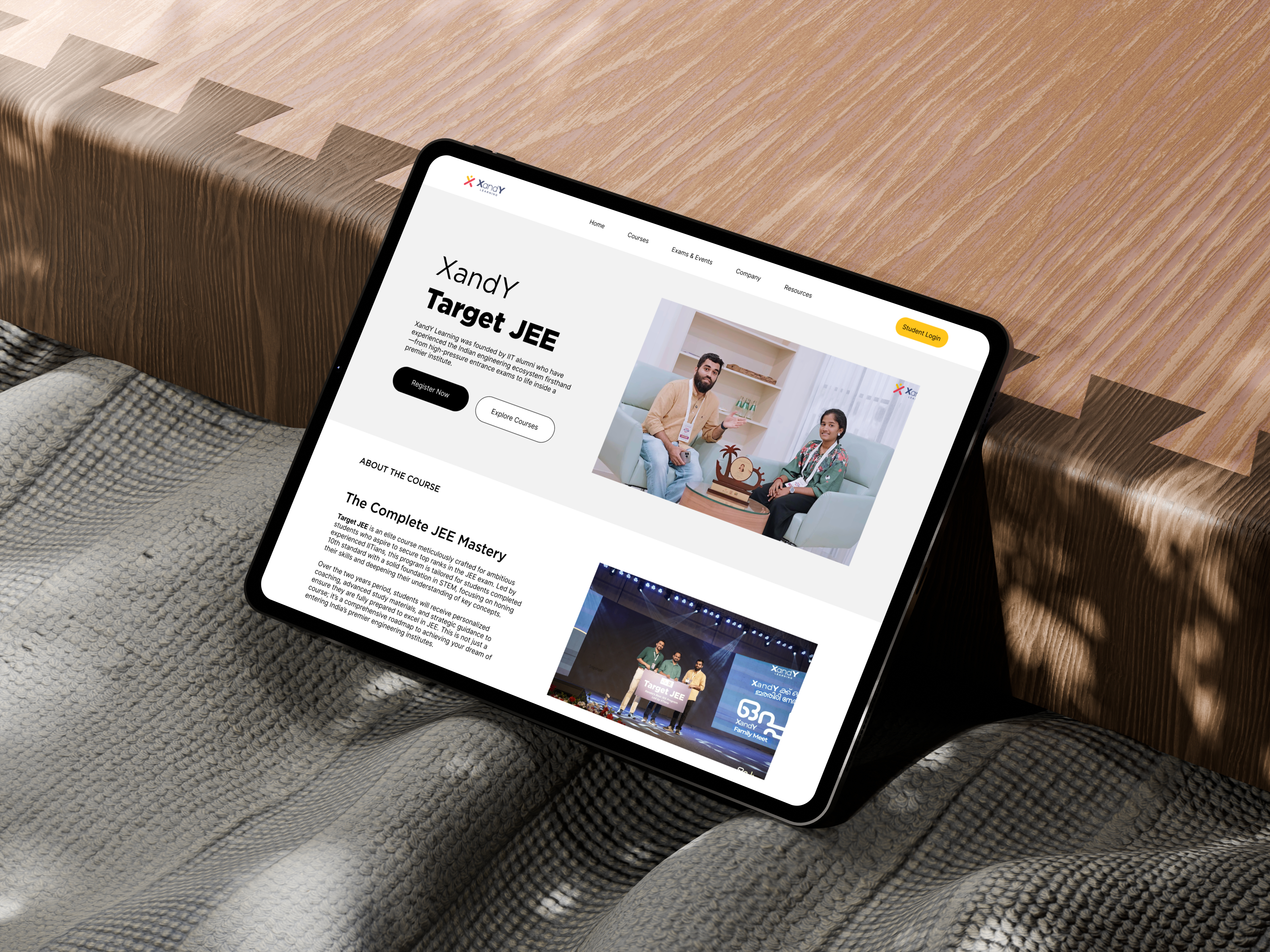
I reworked the website's information architecture to bring courses, exams, events, blogs, and resources under one unified platform. The redesign introduced clearer content hierarchies and reusable page templates, replacing the fragmented experience of separate exam-specific websites with a more scalable structure.
03. Designing Key Pages and Flows
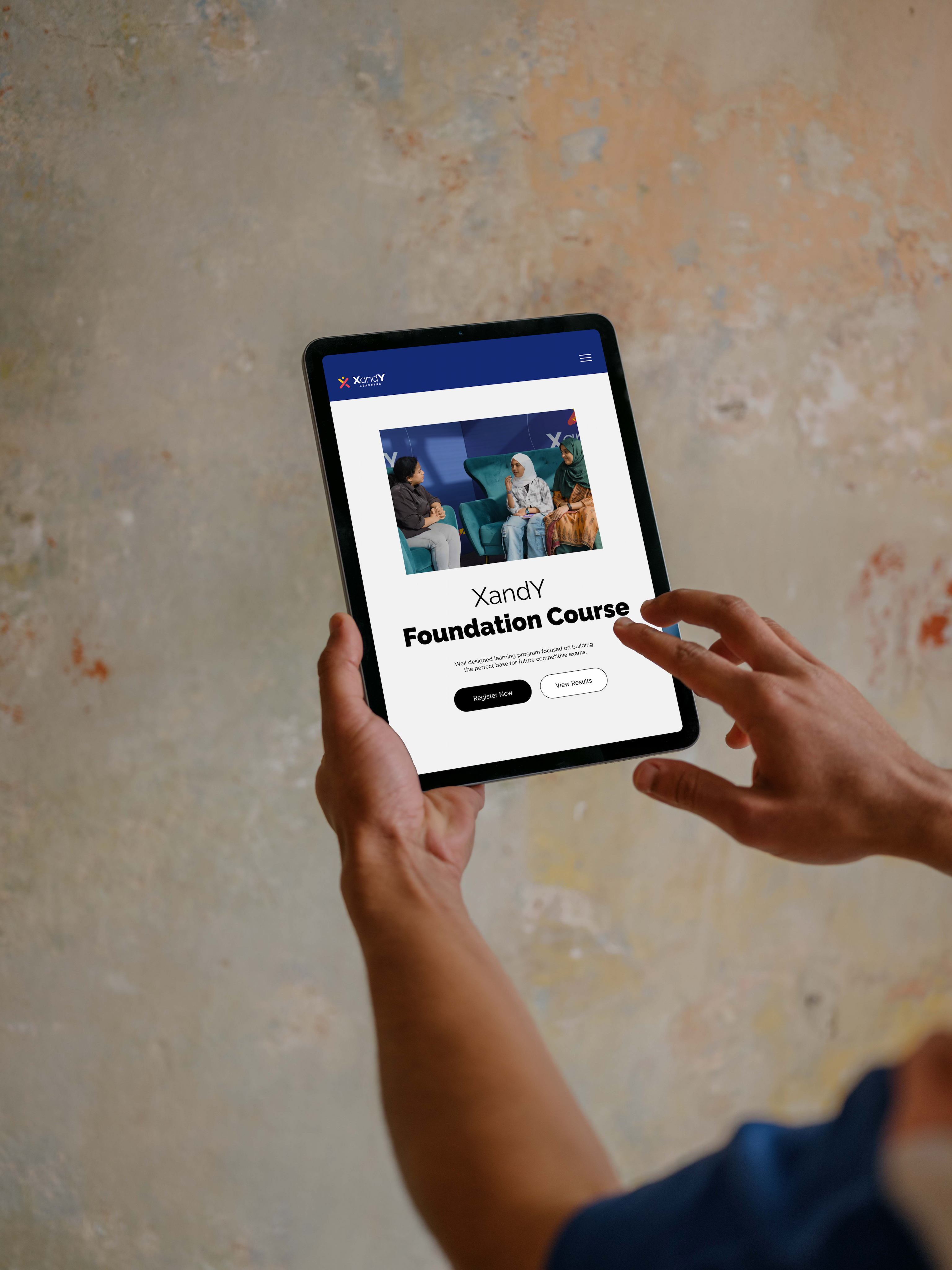
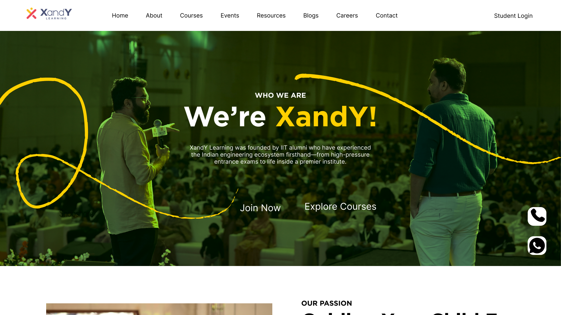
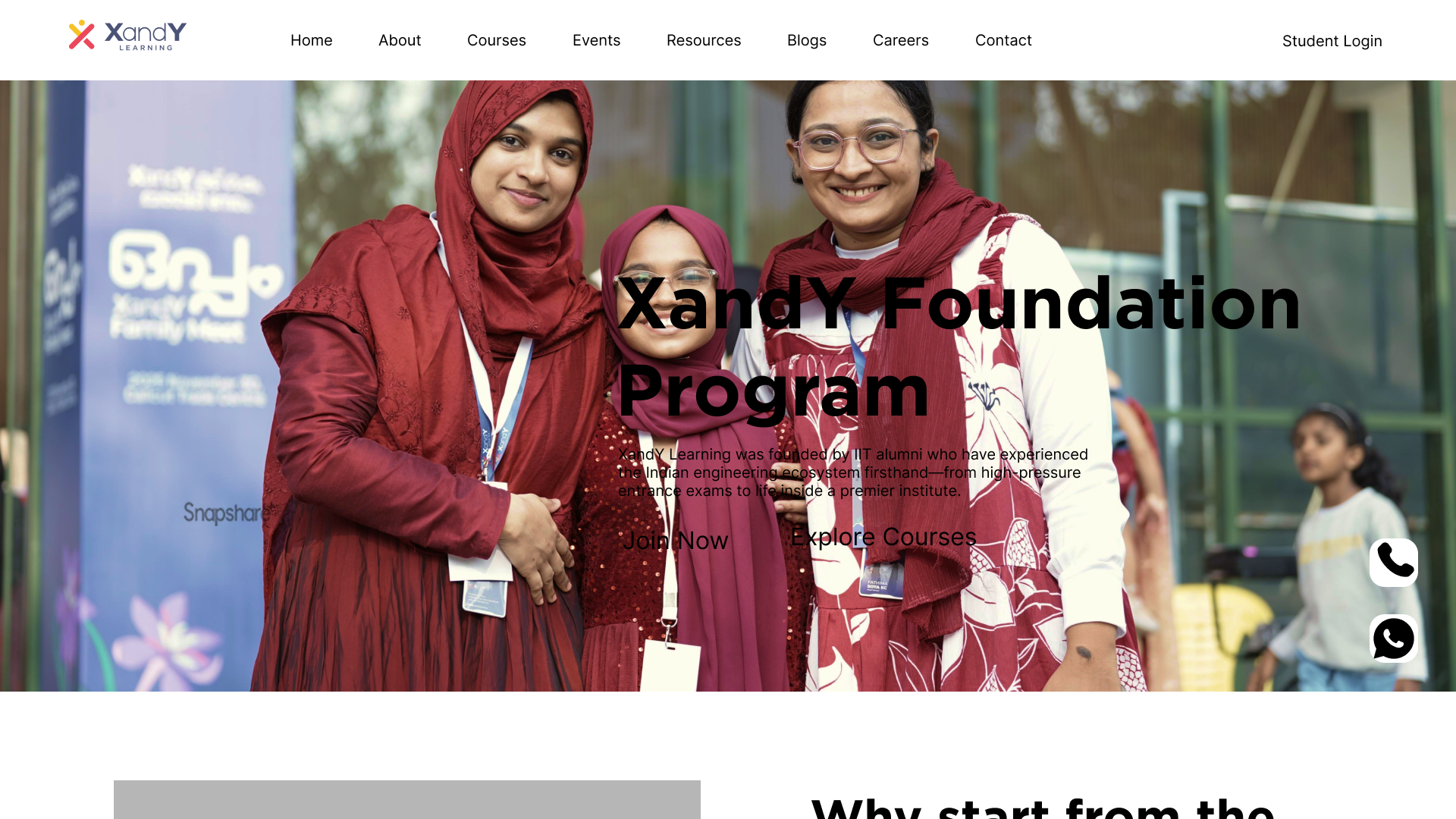
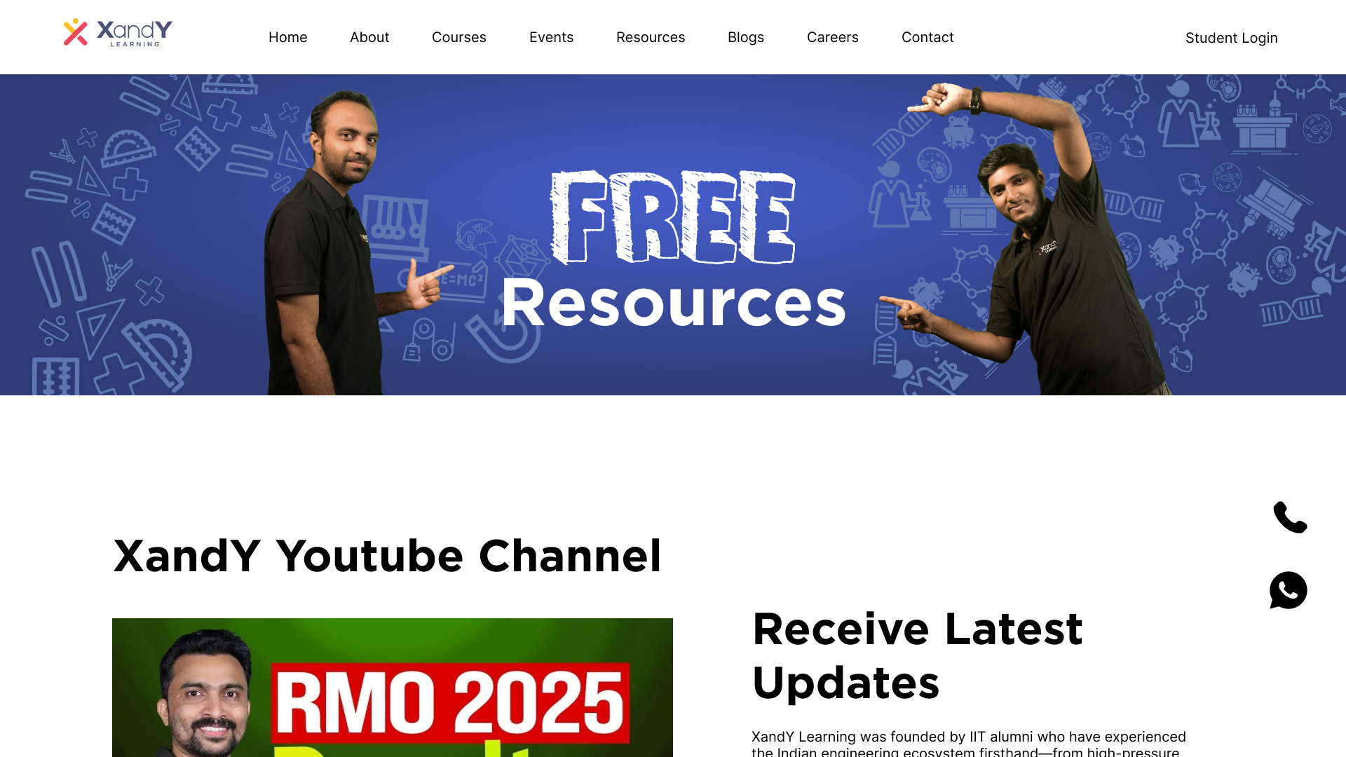
I spearheaded the expansion of the website by designing key pages such as Careers, Payments, and Resources to support business growth. I also refined end-to-end user flows, including a multi-step payment experience with flexible course bundling and payment plans, to make navigation and enrollment more intuitive.
04. Refining the Visual Experience
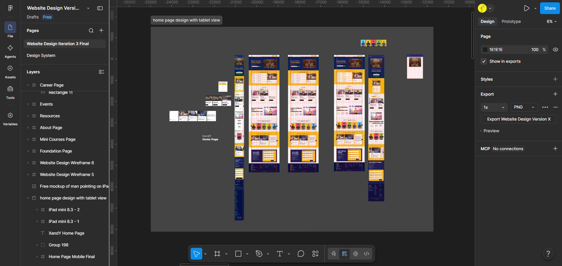
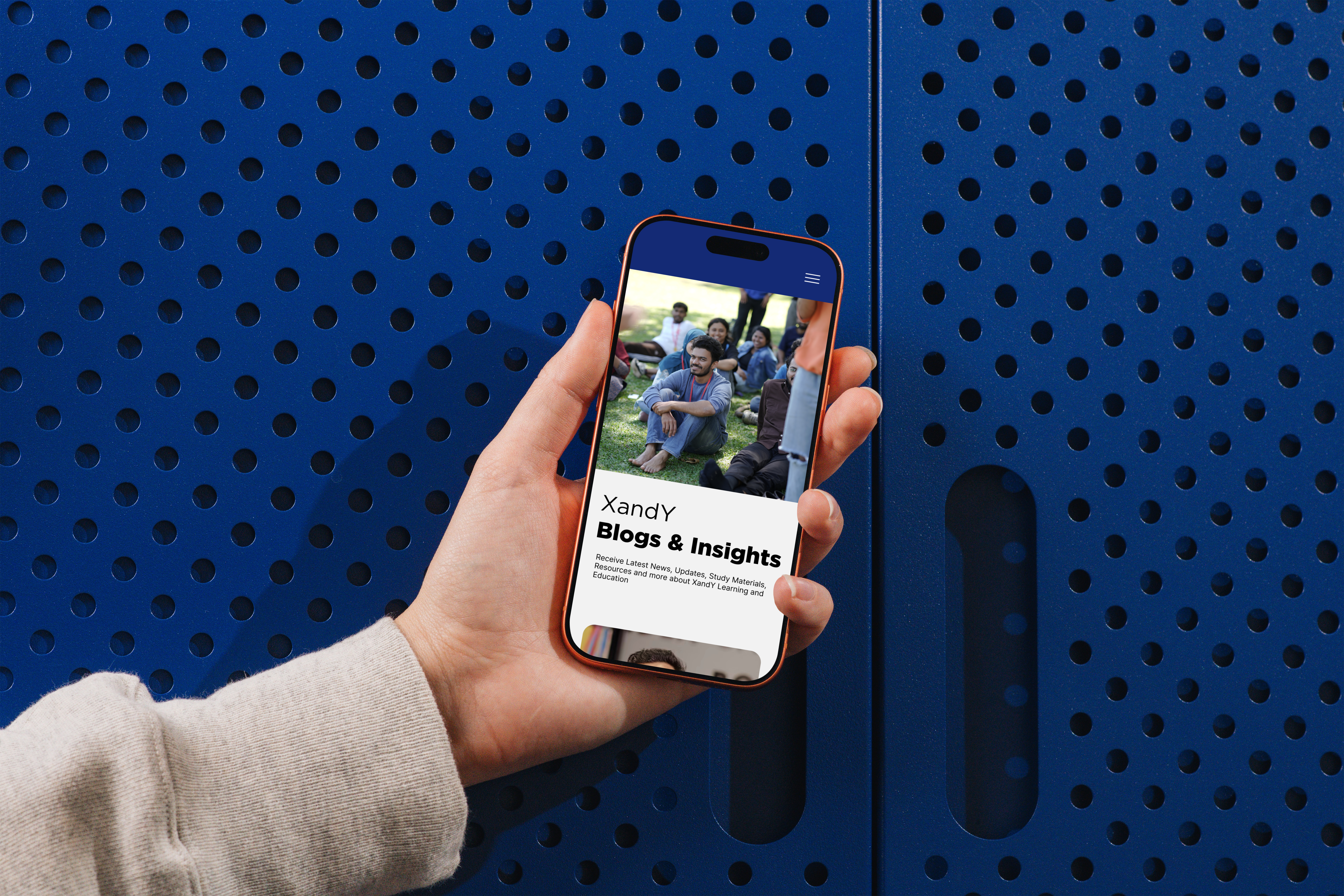
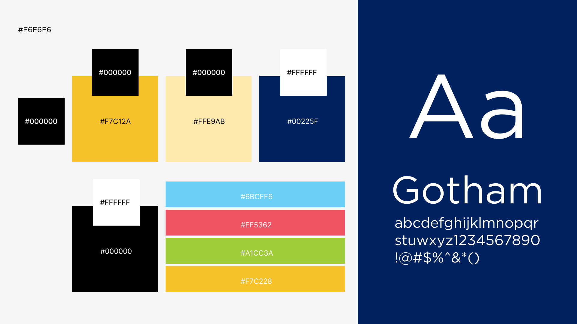
The website was designed using XandY's existing brand language, introducing more engaging visual elements while keeping the experience appropriate for parents evaluating academic programs. Through multiple iterations and stakeholder feedback, I refined layouts & content presentation to improve clarity, consistency, and usability.
The redesigned website was launched at xandylearning.com, bringing the company's core offerings and supporting content into one cohesive platform. The project also highlighted opportunities to improve design consistency and developer handoff, informing ongoing work on a responsive layout and a reusable, well-documented design system.
05. Thoughts After Shipment
This project taught me that research doesn’t always begin with a clear problem statement. Starting from a vague brief, I had to discover what the product actually needed through conversations with parents and mentors. Small insights, such as concerns around comparative rankings, became important design constraints that shaped the experience. I also learned that a design system doesn’t need to be large—a focused system built around the product was enough to maintain consistency and support different states. More than designing an app, the project was about discovering how it should work based on what parents actually needed.